


What is the Symbol on Ash Ketchum's Hat?
This post explores Ash Ketchum's iconic original hat, the Kanto Pokemon League symbol, and how it draws on imagery of Mount Fuji and the real-world Kanto area.

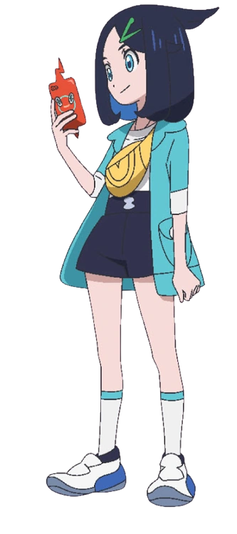
What is the symbol on Ash’s hat? The peculiar symbol has attracted a boom of recent interest following the introduction of the character Liko, who wears a hairpin using the same green mark. Riko will succeed Ash in the role of protagonist in the Pokemon anime going forward, leading to endless questions about why they share the same symbol. Finally, after months of wondering, the Pokemon Company has revealed that Liko will lead a series that begins in the Kanto region.
(https://pokemon.fandom.com/wiki/Ash_Ketchum)
(https://pokemon.fandom.com/wiki/Liko)
Aha. The connection between the two characters might just be that simple: the ambition to rise as a trainer in the Kanto region. The Kanto region, as you likely know, is the original setting of the Pokemon games (Red, Green, Blue, and Yellow) and is loosely based on the sprawling Tokyo areas. Kanto is the name of an actual region in Japan that includes the Tokyo metropolitan area. Saffron City represents the dense, skyscraper-loaded business center of Tokyo, while Cerulean City, Lavender Town, and Celadon City represent the suburbs of the City. Vermillion City, meanwhile, represents the southern reach of the Tokyo metropolitan area as Yokohama, a major port city.
(Official box art for Let’s Go Pikachu and Let’s Go Eevee)
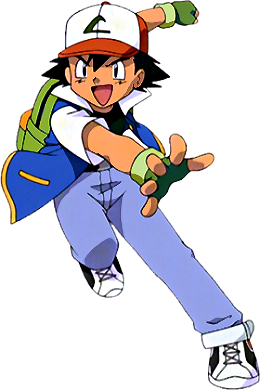
While it does not appear in the games, the Pokemon anime introduces the symbol on Ash’s hat as that of the Kanto-based Indigo League. In the dub, it’s described as “an official Pokemon League hat,” Ash in particular notes that he “had to send in about a million postcards to win that hat.” This has prompted some speculation about what the symbol represents, which has settled on it being an “L” to represent the “League” of the Pokemon League. In the anime his devotion to winning this hat demonstrates Ash’s early fascination with battling and, likely, his early interest in challenging the Pokemon League.

The logo is indeed in the shape of a stylized L: but what gives it that stylized look is also important. This interpretation misses one key aspect of this generation of Pokemon—its close geographic association with a specific area of Japan, Tokyo. And that area of Japan already has a visual mascot, a real place visible from Tokyo on a clear day, that has already been incorporated into countless logos and landscapes. We can see it in the negative space of the Pokemon League logo: a mountain, defined by a curve-shaped wave.
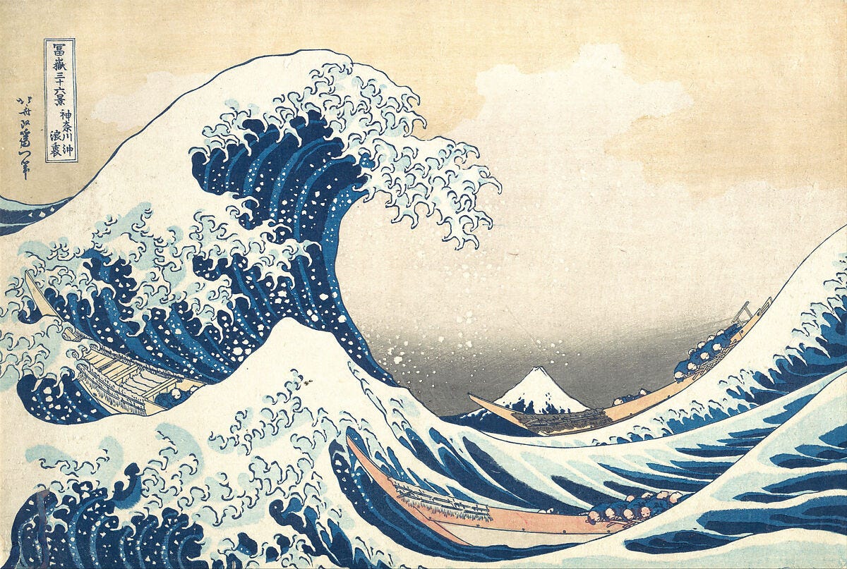
The Pokemon League symbol is none other than a direct reference to Mt. Fuji, and moreover, it’s a stylized version of a specific version of Mt. Fuji: the iconic representation of the mountain in Katsushika Hokusai’s Great Wave (also known as the Wave off Kanagawa). This representation of Mt. Fuji features a low, slight horizontal band of waves, with a towering wave crashing down on fishing boats as it frames the great mountain in the distance. These boats were commonly used in Edo Bay, and this scene thus likely takes place near modern-day Tokyo.1 As is appropriate to its history in poetic representation as an eternal, snow-capped mountain, Mt. Fuji appears in this print with its perennial ice cap and the impression of falling snow.
(Metropolitan Museum of Art)
This is an especially appropriate method of representing the Pokemon League, as the subsequent generation of games (Gold, Silver, and Crystal) makes it clear that the Pokemon League is immediately to the east of an enormous mountain, Mt. Silver, which stands in approximately the same relationship to Saffron City as Mt. Fuji does to Tokyo. Not only that, the Pokemon League Reception Gate also protects Mt. Silver, and only admits the most skilled trainers, with all 16 badges of the Kanto-Johto Pokemon League. And of course, just as in the poetry of Mt. Fuji, there is perpetual snowfall on the summit of Mt. Silver.

(Bulbapedia)
Hokusai’s representation of the mountain tells us something else about Mt. Fuji. As the name of the series in which it appeared indicates (36 Views of Mt. Fuji), the mountain was already an extremely popular site to represent in the early 19th century. And many of its scenes features landscapes of Tokyo (then Edo). Mt. Fuji appears again in a series of woodblock printed books, One Hundred Views of Mt. Fuji, also by Hokusai, and also repeatedly pops up in the series 53 Stations of the Tokaido by Utagawa Hiroshige. The Tokaido is an ancient foot-traffic route connecting Kyoto and Tokyo, from Mt. Fuji is frequently seen; the later use of Mt. Silver as a halfway point between Johto and Kanto appears to refer to the visual backdrop along the path between the two cities. Given that the Pokemon League, specifically the Indigo League, combines one region based on the Kyoto area and one region based on the Tokyo area, Mt. Fuji is the perfect symbol to represent the Pokemon League. (Please note, however— the mountain isn’t visible from Kyoto (Johto), only from Tokyo (Kanto)).
, from the series Fifty-Three Stations of the Tōkaidō Road (Tōkaidō gojūsan tsugi), also known as the First Tōkaidō or Great Tōkaidō, Utagawa Hiroshige (Japanese, Tokyo (Edo) 1797–1858 Tokyo (Edo)), Woodblock print, Japan")
(Metropolitan Museum of Art. Hara: Mount Fuji in the Morning, from the series Fifty-Three Stations of the Tōkaidō Road, Utagawa Hiroshige, 1833-34)
The symbol on Ash Ketchum’s hat almost certainly represents the Pokemon League through this iconic symbol of Japan and Tokyo. And what’s more, it’s very similar to a number of other logos that incorporate Mt. Fuji. For example:

(The Quiksilver logo, which was also the company’s logo when the Pokemon anime was released.)
These simplified renditions of Hokusai’s great wave make the elements of the league symbol even clearer. We can see the thickened tip of the “L”, forming the sweeping arc of a wave, against the silhouette of a snow-covered white mountain. Mt. Fuji, incorporated into the Pokemon League symbol on Ash Ketchum’s hat, serves as a subtle reminder of the presence of Japan in the Pokemon anime, and marks the start of Ash Ketchum’s journey in the real-world Kanto region. Now one of Japan’s flagship franchises, the Pokemon anime first set forth into international broadcasting flying a tiny flag of the nation that created it.
If you are interested in the long, long influence of Hokusai’s Great Wave, please check out this exhibition at the Museum of Fine Arts Boston, which opened yesterday!
https://www.mfa.org/exhibition/hokusai-inspiration-and-influence
For more details about the Quiksilver logo and the logo of its subsidiary brand, Roxy:
https://en.wikipedia.org/wiki/Quiksilver
https://logos.fandom.com/wiki/Quiksilver
https://www.roxy.com/customer-service-corporate-information-about-us.html
Another logo using the Great Wave:
https://mlml.sjsu.edu/2015/12/09/the-great-wave/
According to https://www.atxfinearts.com/blogs/news/the-great-wave-off-kanagawa-so-famous: “The small boats in the print are oshiokuri-bune; quick pontoons utilized by fishermen to ship fish from Izu and Bōsō: the business sectors of the Tokyo Bay, once known as Edo Bay.”